Fine Art Printing
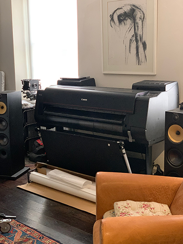
You can just see a pattern print in the top right of this shot.
During lockdown I decided to take the opportunity that was forced upon us and invested in the gargantuan Canon pro 4100 printer. Whilst I have been printing for many years being able to print at this size in-house is a new departure and not a cheap one at that. So it was a tough one to make the decision on and take the plunge. Printing can be a frustrating or joyful affair and it’s not uncommon for buyer remorse but as I have a fair bit of previous with the joys and frustrations and with a very technically difficult exhibition to print with my Standing on the the Edge series. I wanted precise control. Given this and with normal commercial activity pretty much suspended it felt like the proper investment in myself, to keep at it, occupy my mind and maintain a good sense of mental wellbeing.
Printing is an art that has a tendency with the modern world to be neglected. Quite often photographers never print anymore, even professionals, as their work is sent off electronically to agencies and clients and the photographer has no impetus to spend money that doesn’t generate a return. The costs of printing and the lack of commercial client demand can discourage photographers, but if you do print, it will make you a better photographer and bring you great pleasure.
This thing is not shy and retiring but makes world class prints. If you get it right.
My paper of choice for this exhibition and many of my prints is Hahnemühle Photo Rag Satin 310gsm, a beautiful museum quality cotton rag paper. My Eizo Coloredge monitors are profiled with an X-rite Eye 1 display pro so I can trust my monitors output. This is a must and the starting point for everything whether you print or not. If you’re new to all this start here but also get to grips with colour theory and the differences between Additive Colour (the RGB of your monitor) and subtractive colour (the inkjet printing process). There is plenty of info on the web.
To get prints looking like you want we have to employ a system of colour management. This is done using ICC colour profiles (ICC =International Colour Consortium) which are stored on your computer. Each of these little files is a set of data which characterises a colour input or output device. In this case we are looking for the ICC profile that describes this printer (4100) with this ink (Canon LUCIA pigment Ink) with this paper (HPRSatin). You can get ICC profiles from the manufacturers website, in this case Hahnemühle, but because there is variation in even machines of the same make and model number and therefore can only get you somewhere near.
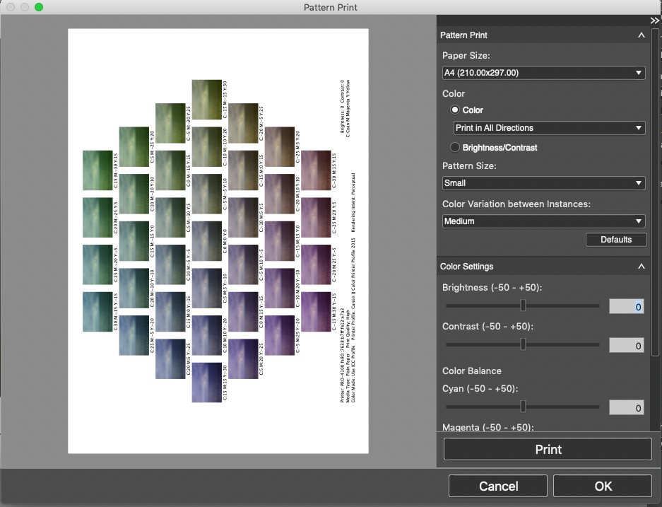
So you’re close but no cigar, at least not yet. Canon, within the software it supplies with the printer (Canon Professional print & Layout), provides this nifty little feature called Pattern print which, a bit like dialling in colour correction on an enlarger you can see the effect of small C,M and Y shifts on thumbnails. You can tweak the steps and the direction of shift if you wish. you can also run patterns for Brightness/Contrast. Now whilst this is a great feature to have and it certainly helped me to hone in on a better print from that the canned printers ICC profile was giving me. It’s time consuming, expensive, administratively onerous and it still wasn’t hitting the nail on the head for me. One of the issues with canned profiles is a tendency for the printer to over ink in the shadow details.
Keeping in mind that a print is a subtractive colour process and viewed by reflective light rather than the emissive device that is your monitor. I was finding that the printer was laying down too much ink in the dark areas of the print. Looking at the histograms of the images which where relatively compressed and well within the dynamic range of the paper I knew it was time for a custom profile.
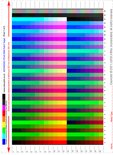
A custom profile is basically an ICC profile created by software from measurements taken from target prints using a device called a spectrophotometer. The trouble being the cost of said device will run you over £3K. However not all superheroes wear capes. Enter ColourPhil.
Phil Cruse is a colour Management consultant who will make for your delight and delectation custom profiles. You make prints of the targets using your paper stock with all your colour management turned off. Pop them in the post to Phil and your work is done.
Then he makes all the measurements and emails you back your ICC profile. You will need a profile for every ink/paper combination you use but the improvement you will see from a well made custom profile is such that you can light the cigar.
The end result of all this effort is prints that are looking spot on for colour and density so that no tweaking of files is required. Thanks Phil.